CASE STUDY: SEWN APART
I had the pleasure of working with Ericka Leigh a few years ago to rebrand her existing company. Ericka is a skilled artist and creates impressive fabric and mixed-media designs; she is also passionate about sustainability and reusing fabric.
Project: Sewn Apart Rebrand
Role: Graphic designer, illustrator, marketing consultant
Software: Adobe Illustrator, Adobe Indesign
Project vision
To create an updated, bright design that could be used on various marketing materials. Embody both a modern and vintage feel.
Challenges
• To find a color that worked well and did not seem like an emergency shade.
• This icon had to look both vintage and modern.
• Create a logo that would not feel too feminine and alienate any demographics
• A logo that would work well on various points of sales materials
• Unique logo that would set her apart from other vintage shops

Original logo
The original logo had been made a few years ago and the design files had been lost, so Ericka was unable to use the design on different marketing materials. She also wanted a new look for her business.
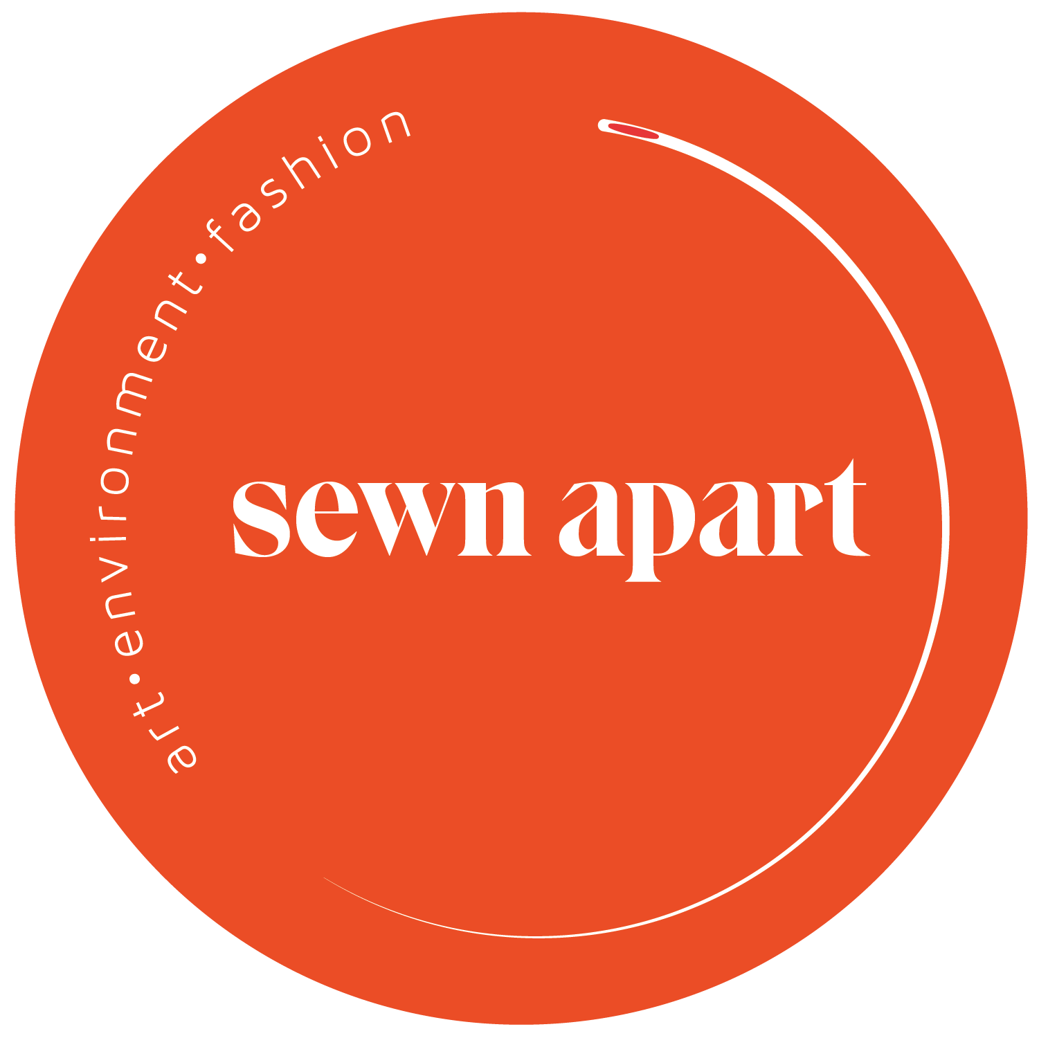
Solution
The biggest challenge with this project was finding the right shade of red and font combination. Ericka wanted to use a bright red that would be eye-catching and fun. She wanted to use a font that reminded her of vintage magazines and had a modern feel. I took her love of sewing and worked it into her new logo, and I used a vintage feeling font to represent her love of all things vintage. I wanted this logo to feel like Ericka and not just be a pretty design. I kept the design circular for stickers for promotion and marketing. We created a tagline that would embody the company's core values. The circle needle was perfect for this logo. It was minimalistic and modern and would allow me to apply a vintage font to the logo. The final result is a bright orange-red logo, a unique, reimagined vintage with a modern finish, quite like her art.