CASE STUDY: FSR DASHBOARD
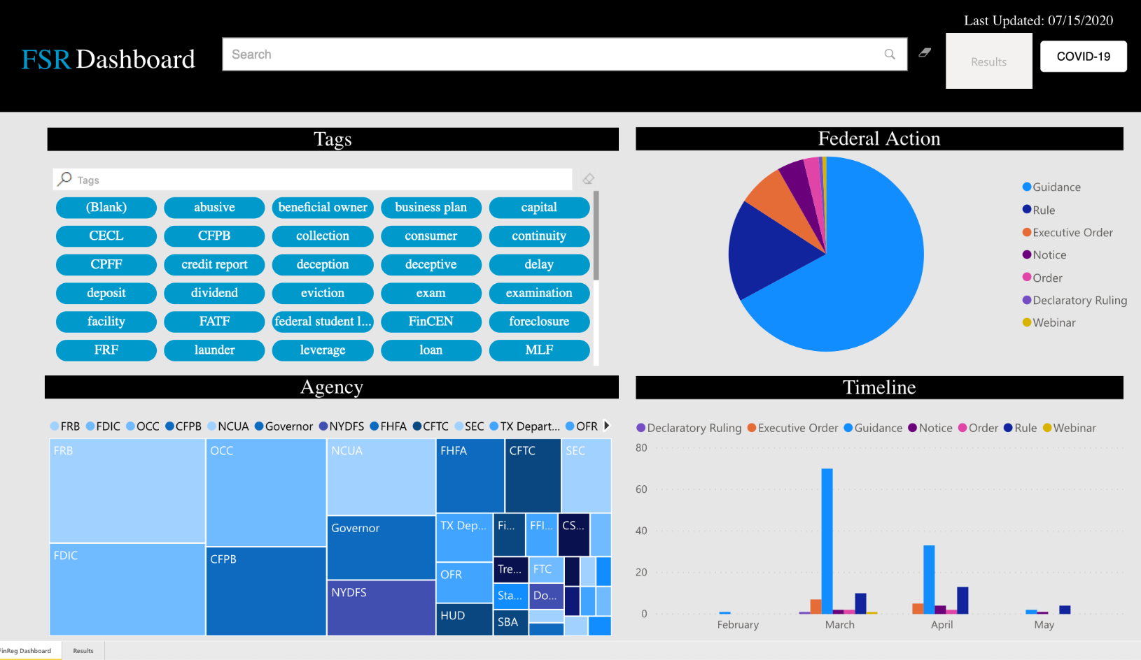
I had the chance to work on a team of designers, developers, and lawyers to create our FSR Dashboard. The design is created in Power BI. I worked with our Power BI experts to refine and customize the program to make this sleek modern tool. We took Power BI to its limits to ensure the design was on brand and easy to use for users of all ages. We have continued to refine the tool as we receive feedback from users. I used Adobe XD to prototype the tool and create mockups which I discussed with our developers to ensure the designs were possible.
Project: Financial Services Regulatory Tool
Role: UX designer
Software: Adobe XD, Power BI
Problem
To create an attractive tool that would work for all ages, it must be easy to use and show a detailed amount of information.
Challenges
• To create a beautiful streamlined tool using Power BI, which has significant limitations to palette and interactions.
• Create a tool that worked on mobile without loosing any functionally
• Create a tool that could work across regions
Original Power BI design
User Research
Users by job function
User Interviews
When the dashboard was shown and tested by users internally of different ages and seniority, they came back with the following responses:
Testers did not know what they could do on the dashboard and understand all of its functions
Search doesn’t immediately show results to the user
The search was not intuitive
Tags not intuitive
Older users loved the tags
Younger users loved the search option
Want results all on one page
Solutions
We decided to implement the following changes:
Add a filter by
Filter by one tag restrictions
Add a last update date to the dashboard
Add a tutorial to guide users
Show a top 10 tags
Filter by keywords


