Uncurl
Hip-and-spine health for desk workers. A structured stretching protocol delivered in micro-doses throughout your workday.
Role: Lead Product Designer
Type: Mobile (iOS)
Why I made this
Most desk workers know sitting is bad for them. Few do anything about it. I'm one of them — I designed Uncurl partly because I needed it. By the time I was deep in this project, I'd noticed how stiff my own hips had gotten from days of sitting at a screen.
There's a gap in the market. Wellness apps focus on the mind. Clinical PT platforms like Sword Health and Hinge Health require insurance and a referral. Generic stretching apps are random Pinterest content with no underlying program. Nothing sits in the middle — something serious enough to make a difference, accessible enough that anyone can use it.
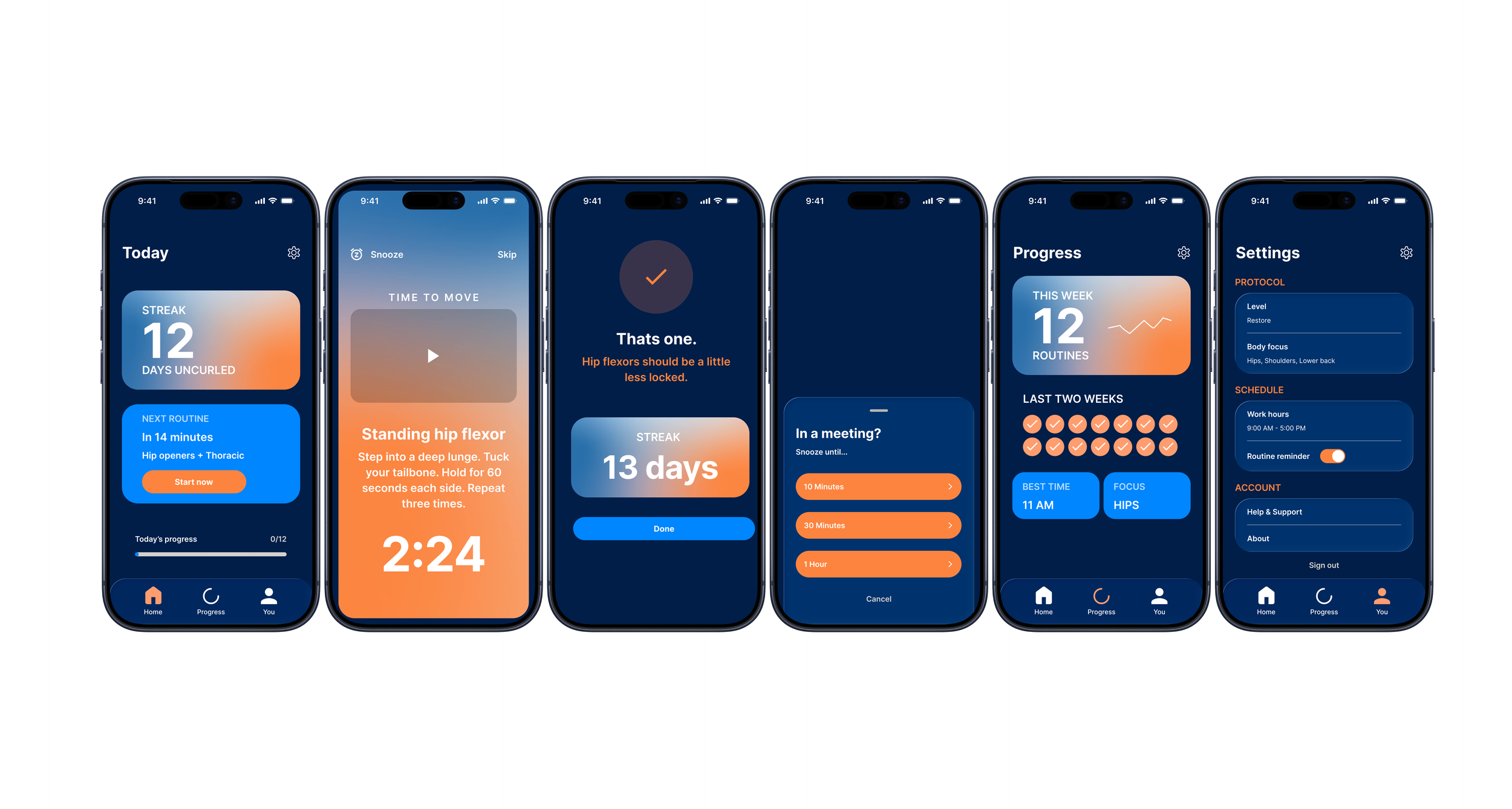
Uncurl is that product. Pomodoro for your body. You work in focused intervals. On each break, you get a guided 60–90 second stretch on a protocol matched to where you're at.
How I approached it
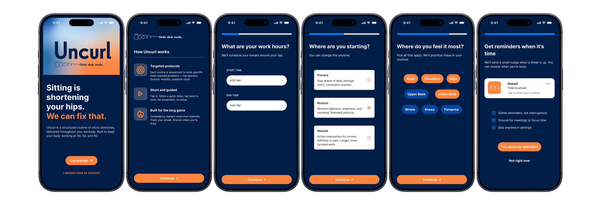
Specific over generic. I wrote the welcome screen copy first — "Sitting is shortening your hips. We can fix that." — and that single line forced every other decision into specificity. Real protocols, real body areas, real consequences. No "take a break to recharge!"
Restraint over abundance. The wellness category leans soft and pastel. Uncurl is dark navy with an adult, almost clinical voice. The mesh gradient — the most expressive part of the brand — only shows up in three screens: welcome, the streak card on Home, and the active break. Because it's rare, it lands.
Native, not just on the platform. Home and lock screen widgets, notifications, and the snooze flow were designed as core product surfaces. Uncurl is meant to live in the periphery of your day, not just inside an app icon.
Protocol naming and the hero screen
The decision I'm most proud of is the three protocol levels: Prevent / Restore / Rebuild. Each name tells you where you fit based on your body state — Prevent if you have no pain yet, Restore (default) if you feel the tightness, Rebuild if you're already dealing with chronic stiffness. It's also a graduation arc.
The active break screen is the hero. Full mesh gradient — the only screen where it takes over. A video demonstrates the stretch. The instruction is direct: "Step into a deep lunge. Tuck your tailbone. Hold for 60 seconds each side." The countdown is huge. Snooze is one tap away in the top-left, because real users get pulled into meetings.
The completion screen sets the brand voice: "That's one. Hip flexors should be a little less locked." Not "Great job!" — that wouldn't fit a product about real bodily work. The line is small, specific, and points to a long arc.
The system
Color: Dark navy surface, orange action, white content. Mesh gradient for moments only.
Type: Space Grotesk, H1–H6 + body styles, mobile-optimized.
Spacing & radius: Token-based, referenced as variables in every component.
Components: Button (27 variants + icon boolean), Input (4 states), Chip (2 states).
What I learned
Positioning is a design problem. I spent real time figuring out what Uncurl isn't before designing anything.
Restraint makes things feel premium. Early on I had the mesh on every screen. Pulling it back to three made each one earn its place.
Writing is a design tool. I wrote the welcome and completion copy before designing those screens. The words forced the visuals into specificity.